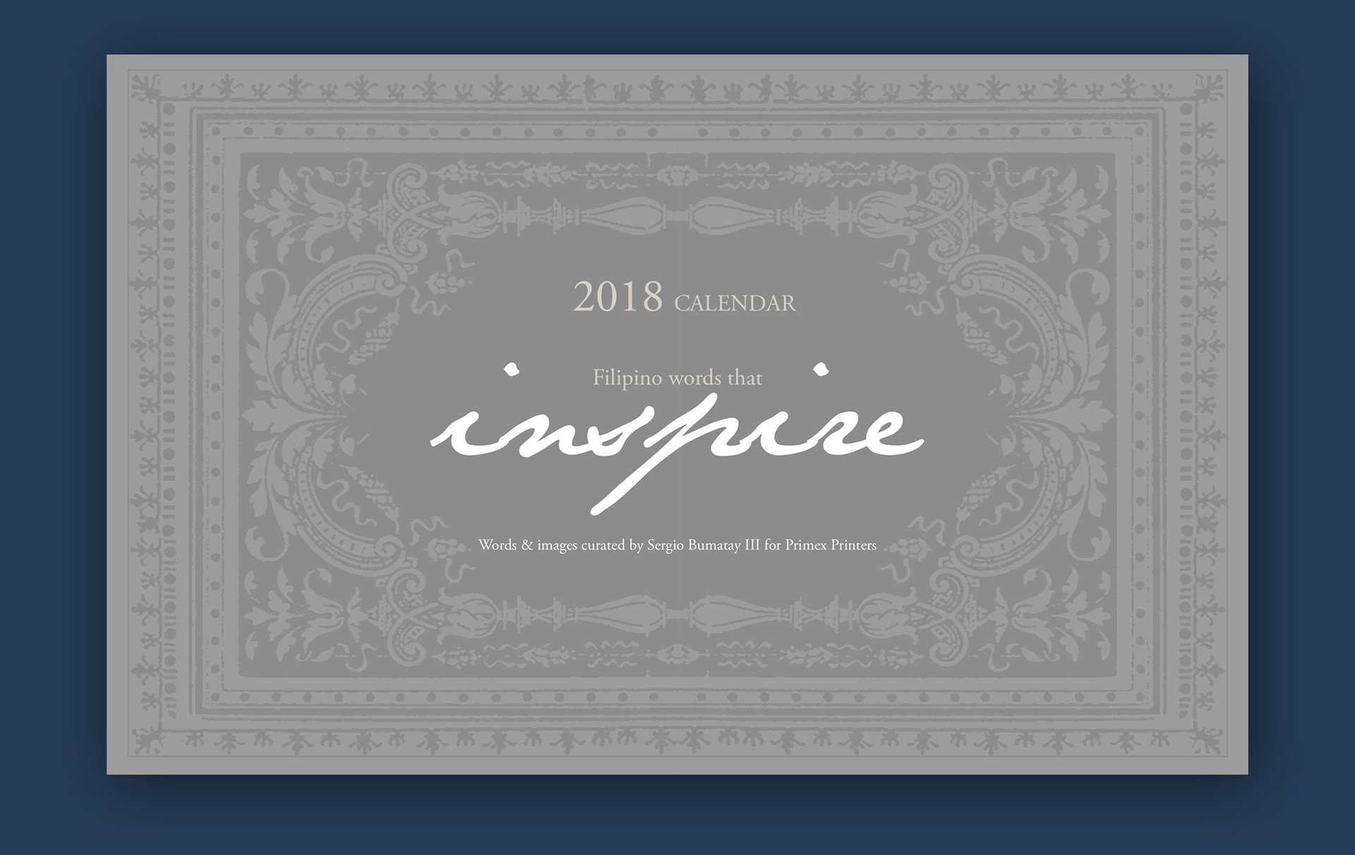
The original design is an intricate stock pattern.
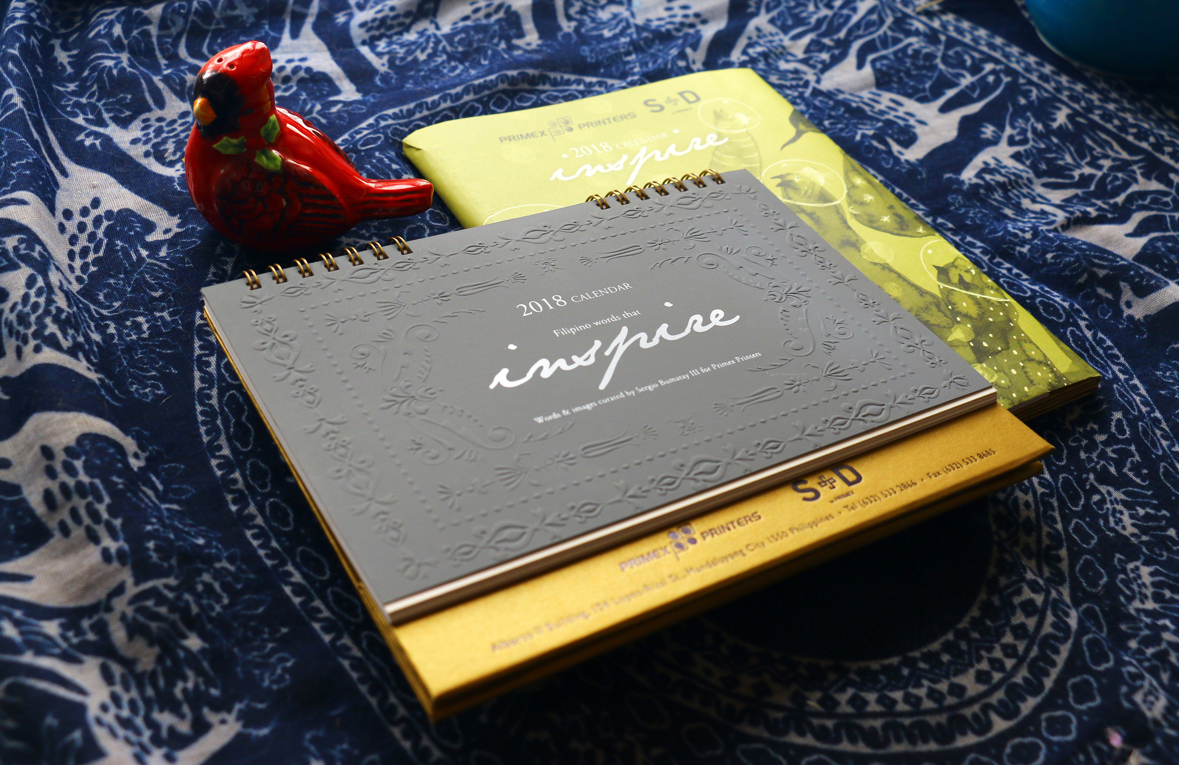
Words and images were curated to reflect the values of the company, a premier printing house.
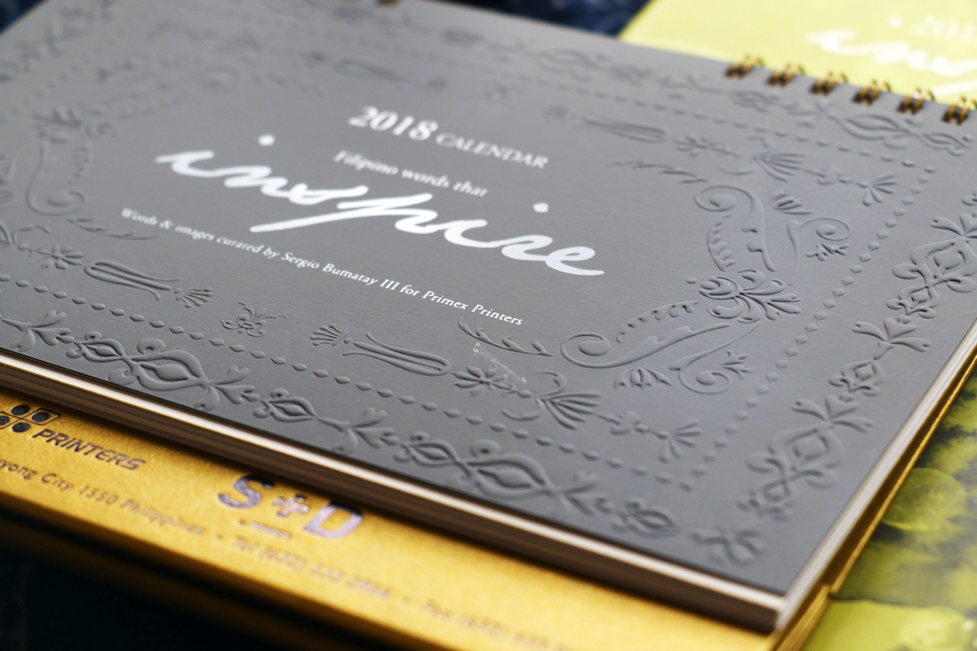
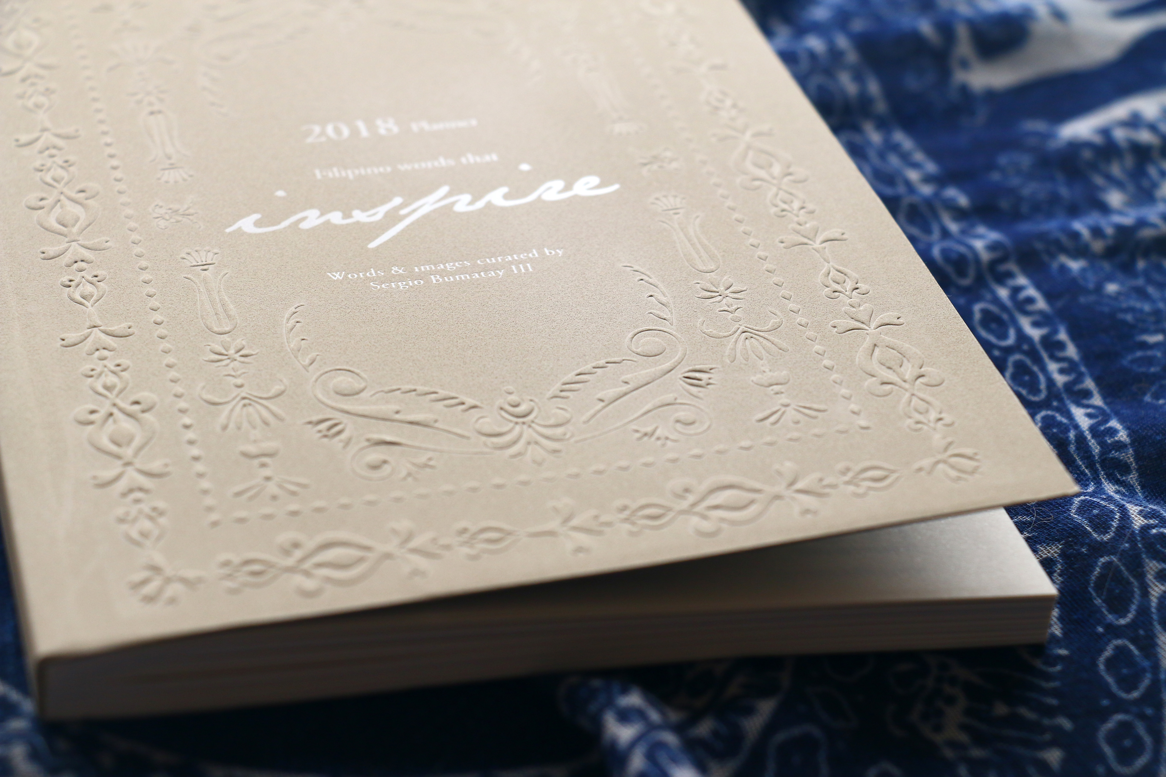
The original pattern was too intricate for the dry embossing cliche so the design was revised to a simpler and streamlined pattern.
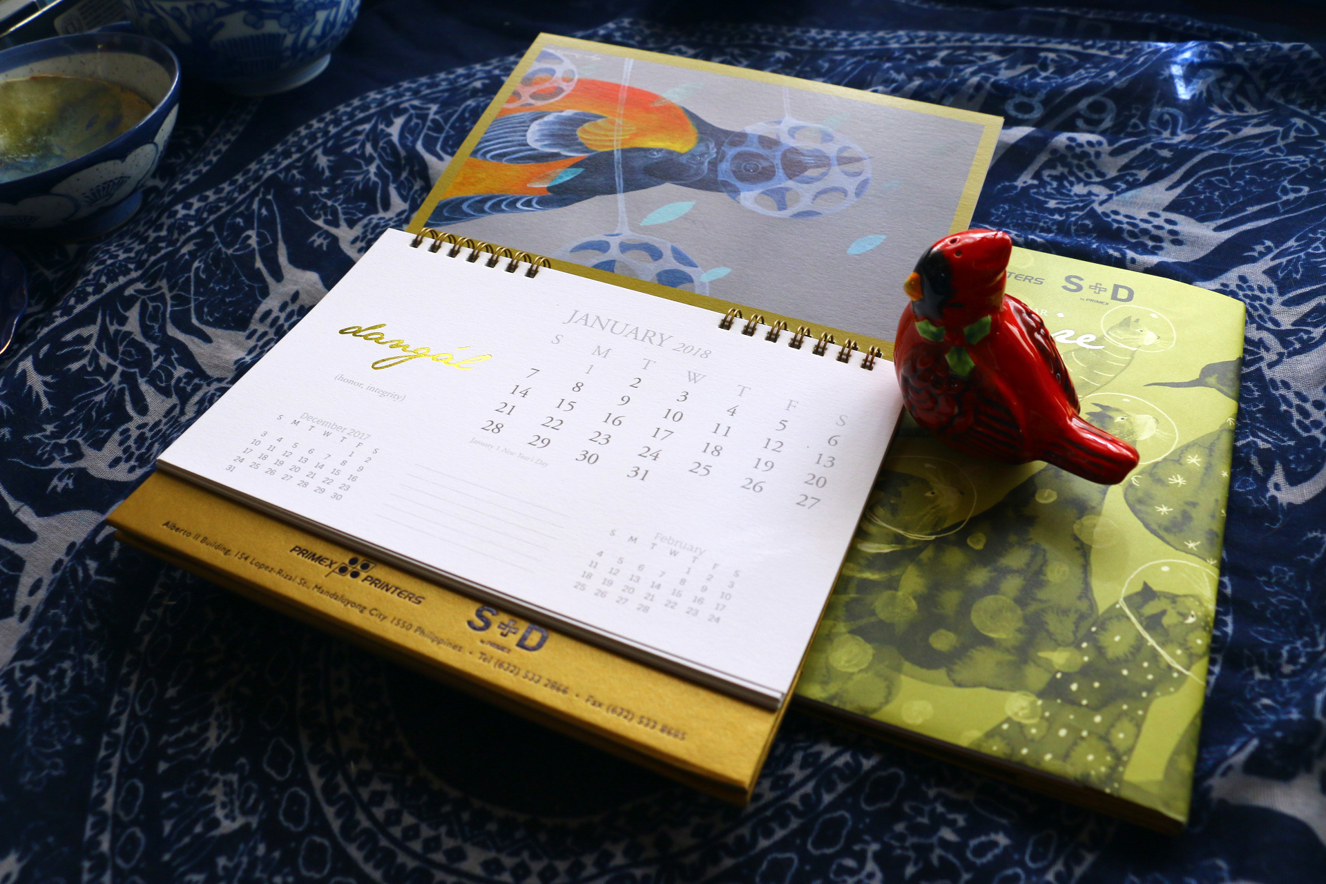
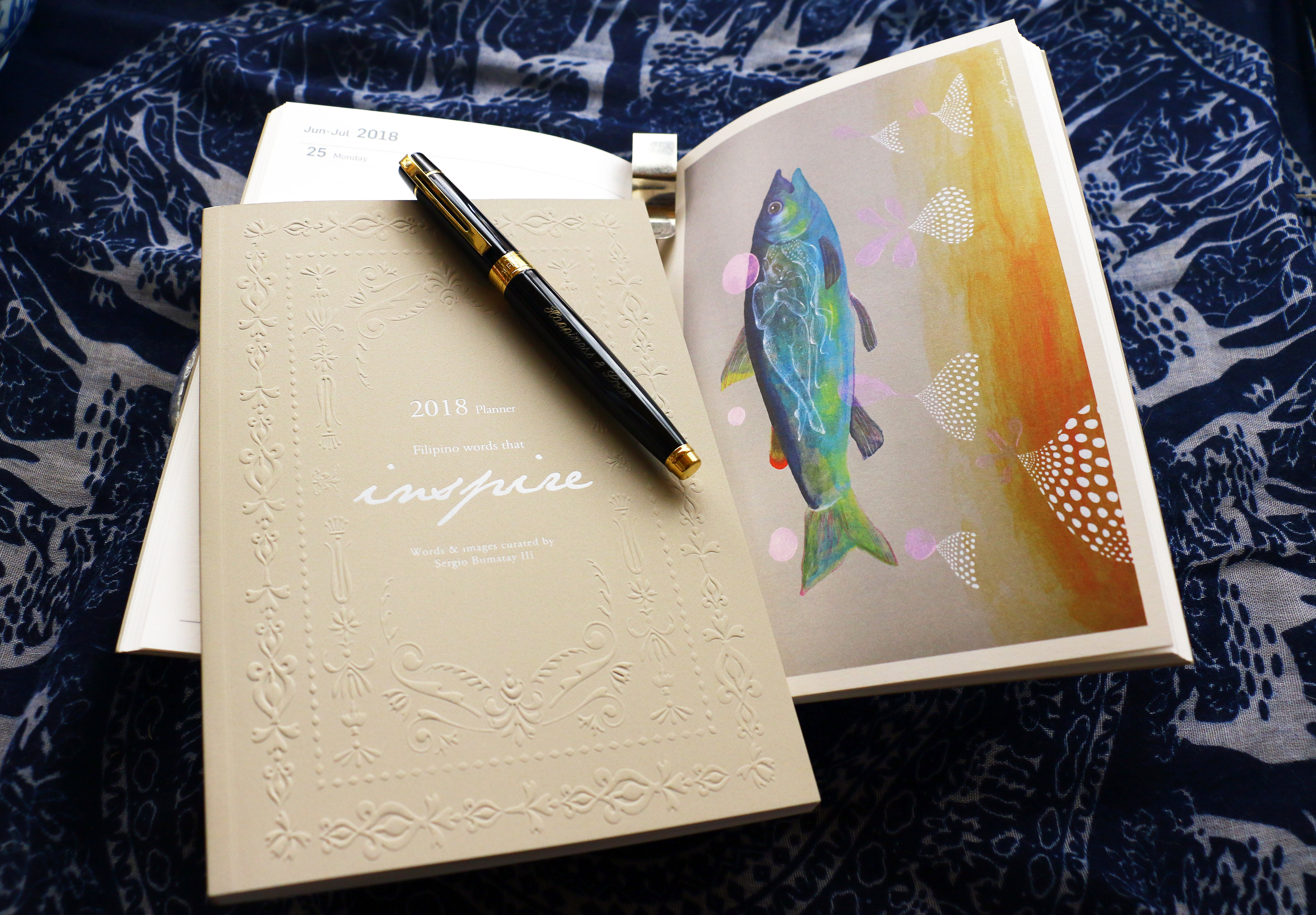
Personal illustrations visually enhance the paired words and the wrapper.
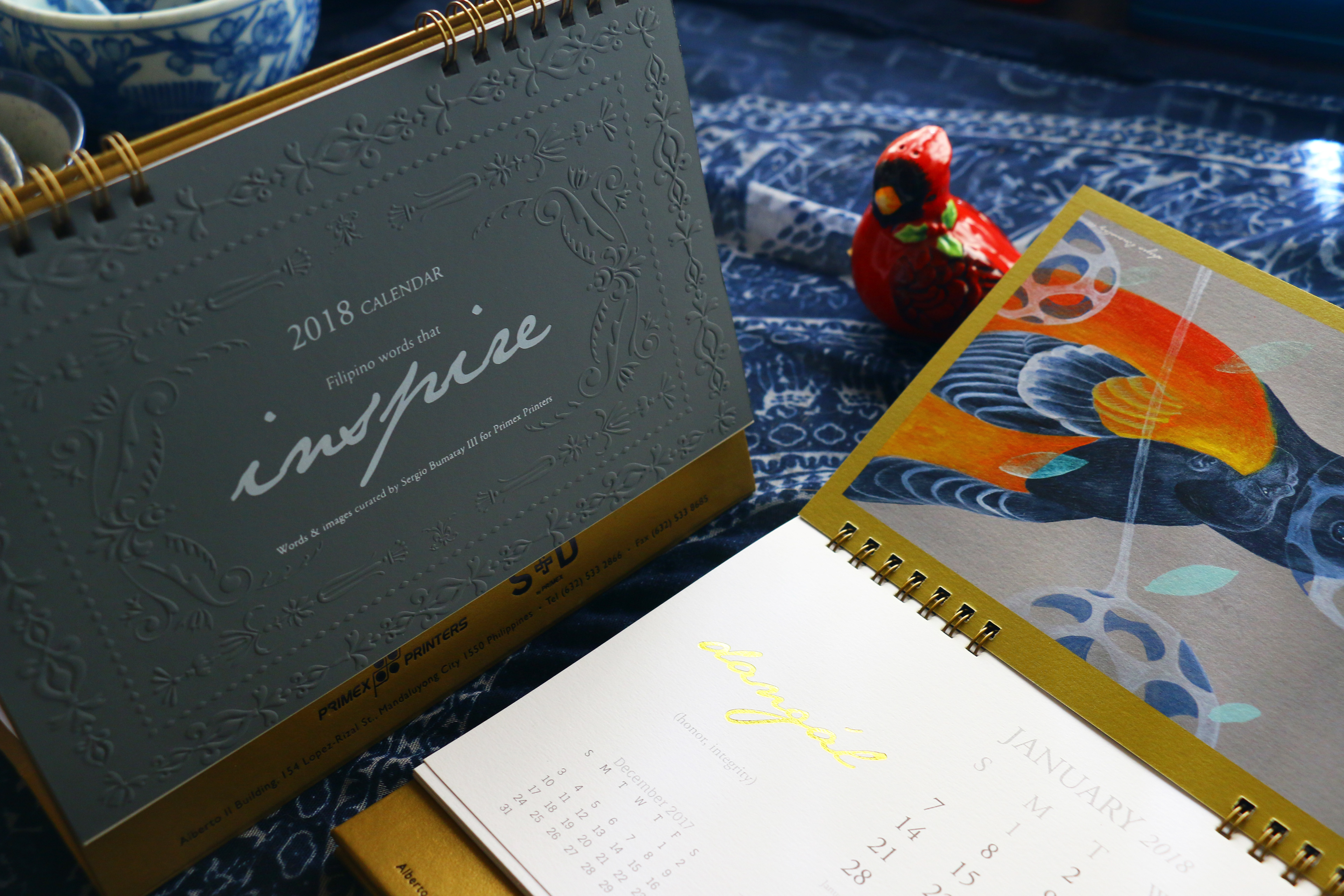
White ink on special gray paper and gold stamping highlight special words.
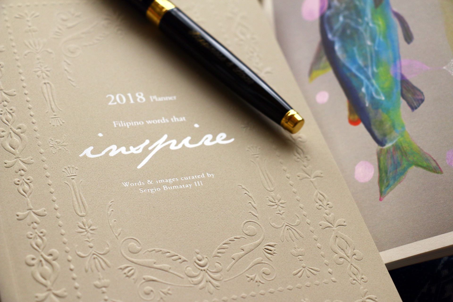
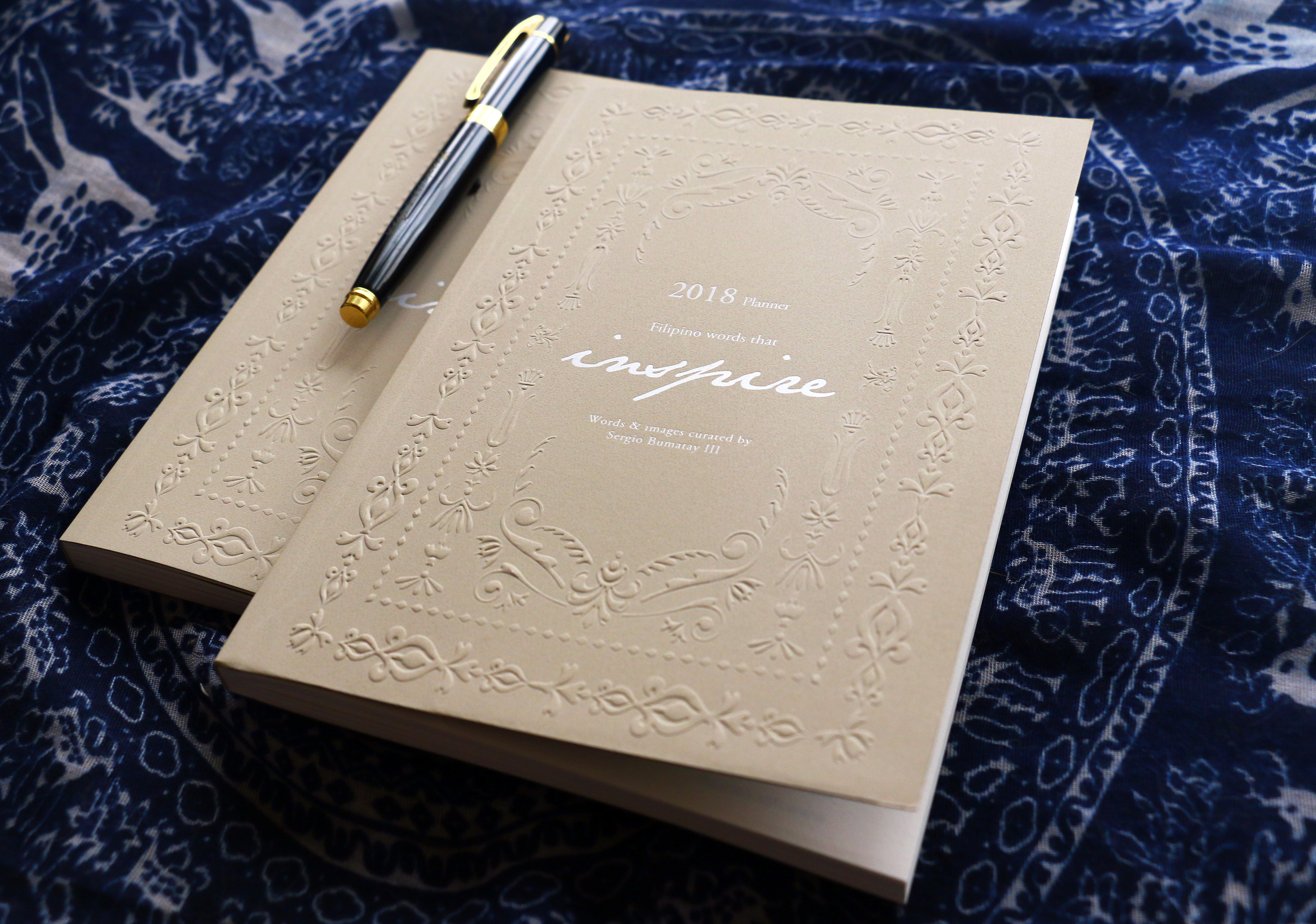
White ink on leather-like textured paper creates a remarkable tactile experience for the planner.